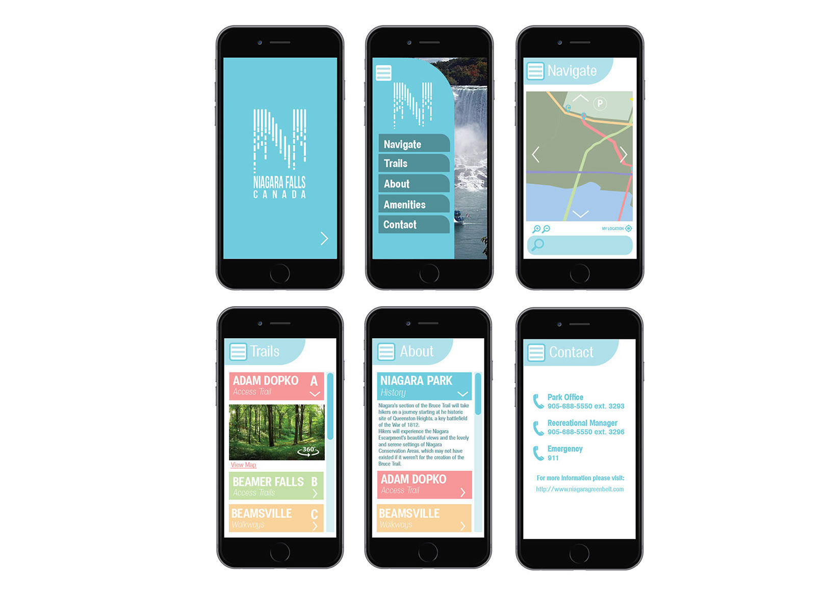
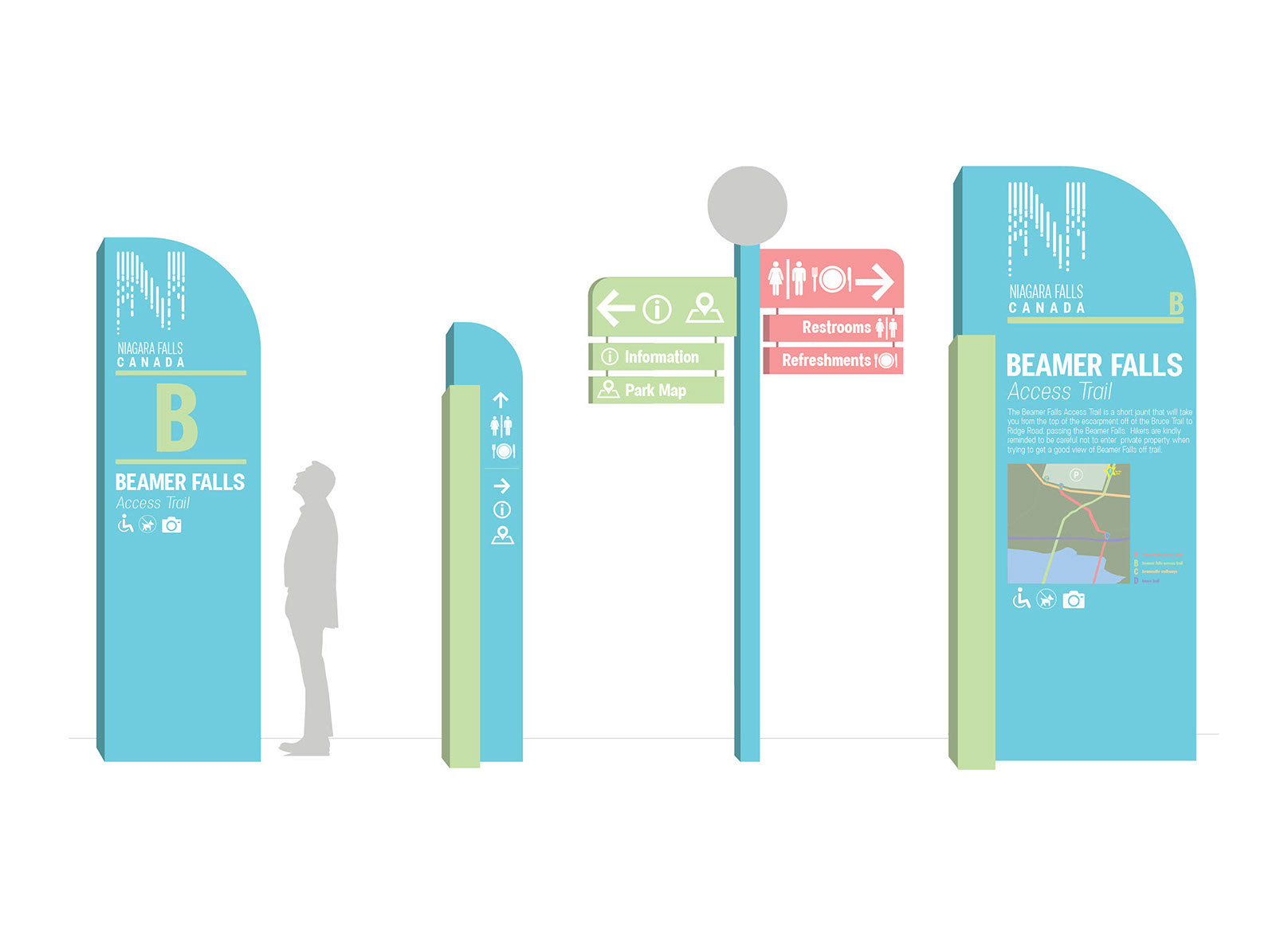
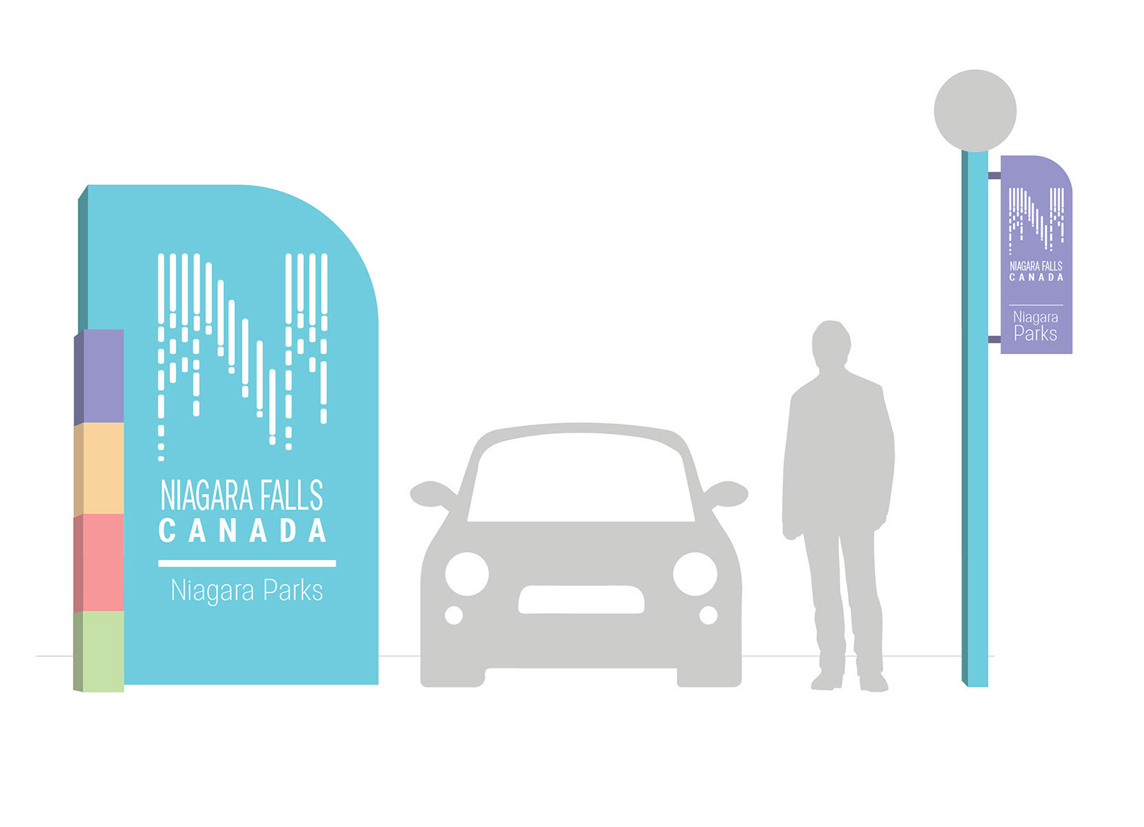
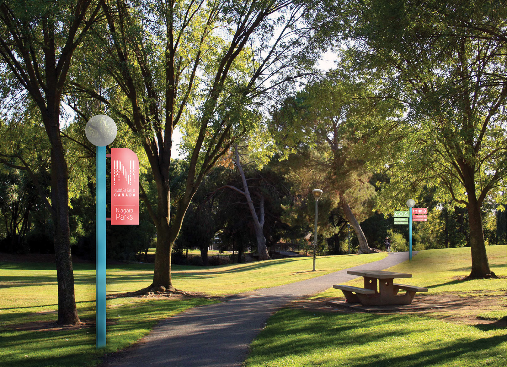
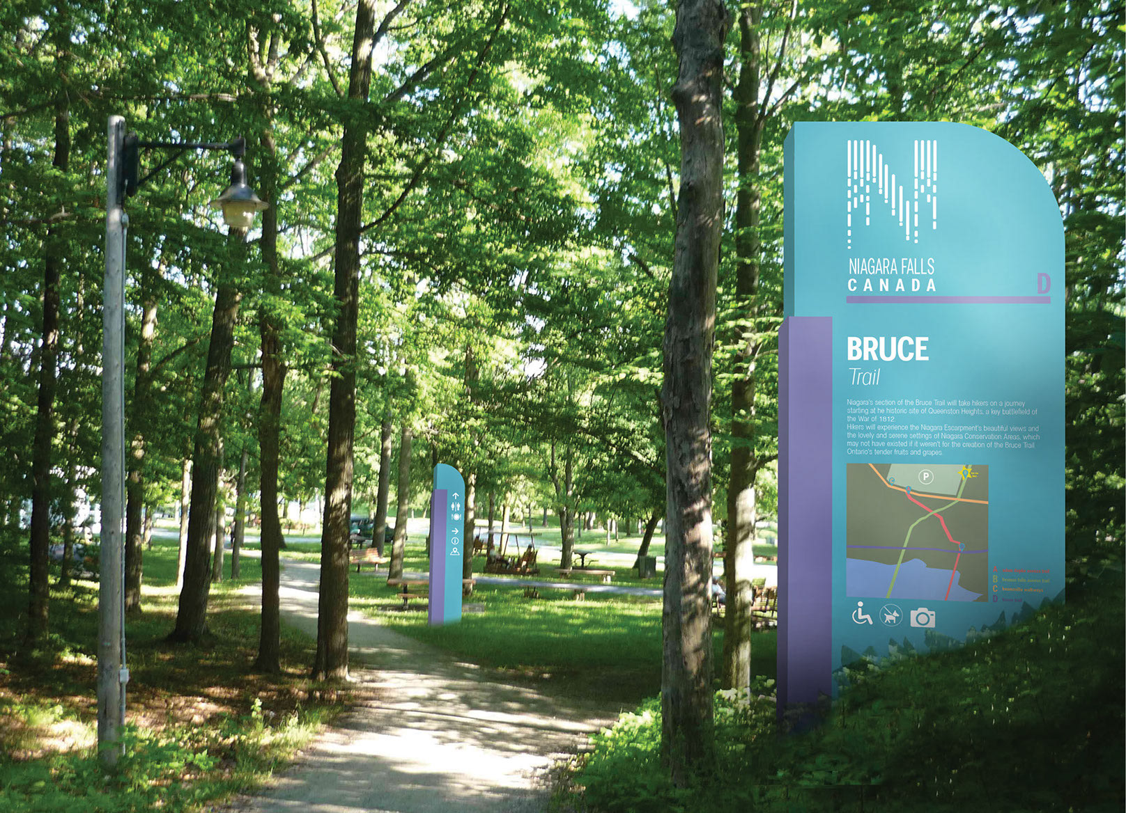
For this assignment, we were tasked with rebranding a city park and create a wayfinding system and app. The logo and overall look was supposed to represent the city and the wayfinding was meant to be clear and efficient. I designed a logo for Niagara Falls Canada. It features an "N" shape comprised of little squares that gives the illusion of falling water. The signage was matched to the logo and features a bright colour palette that identifies each zone in the park.
