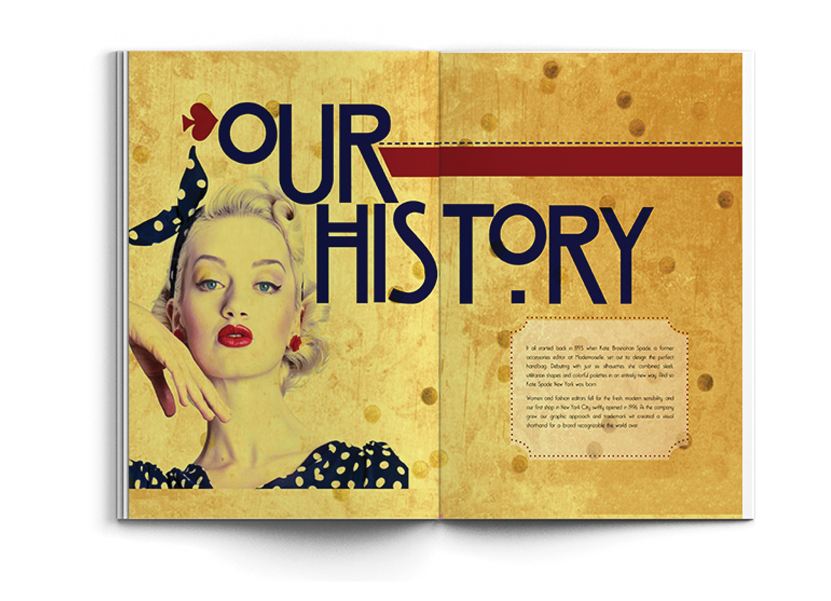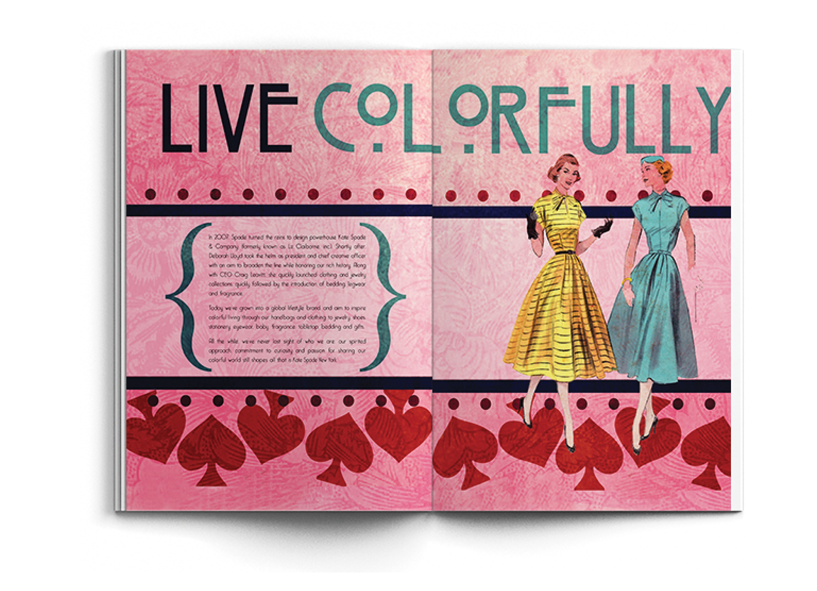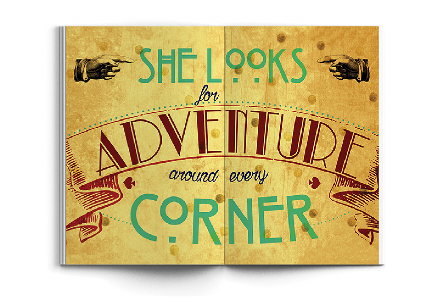


My goal here was to choose a designer to make a typographic based brochure for the Design Exposition. Kate Spade was my choice, I wanted to do something that was inspired by her style but not identical. For the brochure I went with a feminine vintage look with heavy focus on the typography. I used alot of different textures, patterns and fashion illustrations to get that vintage feeling. I wanted it to be bright and lively because Kate Spade uses alot of colourful and fun patterns. I also repeated the signature spade throughout the brochure.
